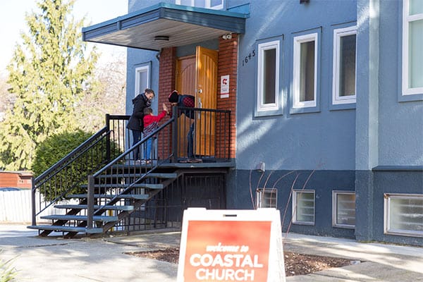
Attend a Weekend Service
Coastal is a non-denominational, and multi-site church meeting in the heart of urban city centers. Greater Vancouver has become a mosaic of various cultures and the life of the church reflects that with more than one hundred nationalities represented on any weekend. Learn more by visiting our campus pages!


Life Groups
Whether you’re meeting online or in person, Life Groups are how we build community and lasting relationships. You’ll find it helps you engage with God’s Word and grow in spiritual maturity through discipleship.
Just like most things, you won’t know until you try!

Stay Connected
Don’t be lonely in the city! During this season of uncertainty, we want to help you continue to grow your faith and stay connected to Coastal Church.
Read engaging articles from our pastors that address topics relevant to our world today. These are written to encourage you and help build your faith.
Discover events, online courses and upcoming programs. You can add events to your calendar or register online if necessary.
We all face situations in life where we need care and support. In these times it can be difficult to even know where to begin – but we can help!
There are opportunities for you to share God’s love with people in need. Click the link above to discover how you can volunteer, donate, give, or pray.